SITE007
Brew Atlas
A learning site for finding information by brewing method
Split six extraction methods into three groups, each with its own comparison screen.
From product presentation and archives to information discovery and motion-led experiences — 11 projects exploring different ways a website can work.
Structured so pages as different as the home page, parts introduction, technical details, and journal still read as one consistent product.
Started with a real-time 3D model, which never reached the quality we wanted.
Switched to still imagery instead of the 3D model, and reorganized six pages so the product reads consistently across them.
Six pages are complete; the mobile screens are still being refined.
The final version uses still imagery.
These six projects differ the most from one another.
A learning site for finding information by brewing method
Split six extraction methods into three groups, each with its own comparison screen.
A lighting site that starts from the effect of light
Instead of listing products first, visitors choose the lighting effect they want.
A site for a fictional modular audio product
Tried a real-time 3D model, then switched to still imagery when it didn't reach the quality we wanted.
A site that conveys scale and distance through motion
Kept video and depth on the home page only, and let the other five pages read quietly.
A site for finding and comparing architecture and interior materials
Rebuilt the list from scratch because the original structure didn't work for finding and comparing materials.
A car site that reads as one continuous sequence
Split the page into five parts, each with its own role, so specs and copy stay readable even in motion.
11 projects in total.
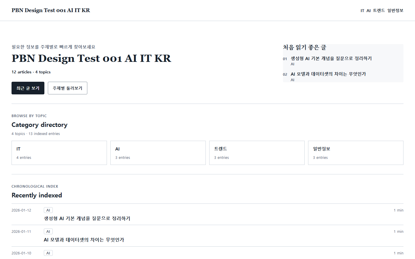
A reference site for finding materials by topic and year
Brought classification, search, and the path to individual entries together in a single first view.
View Work ↗
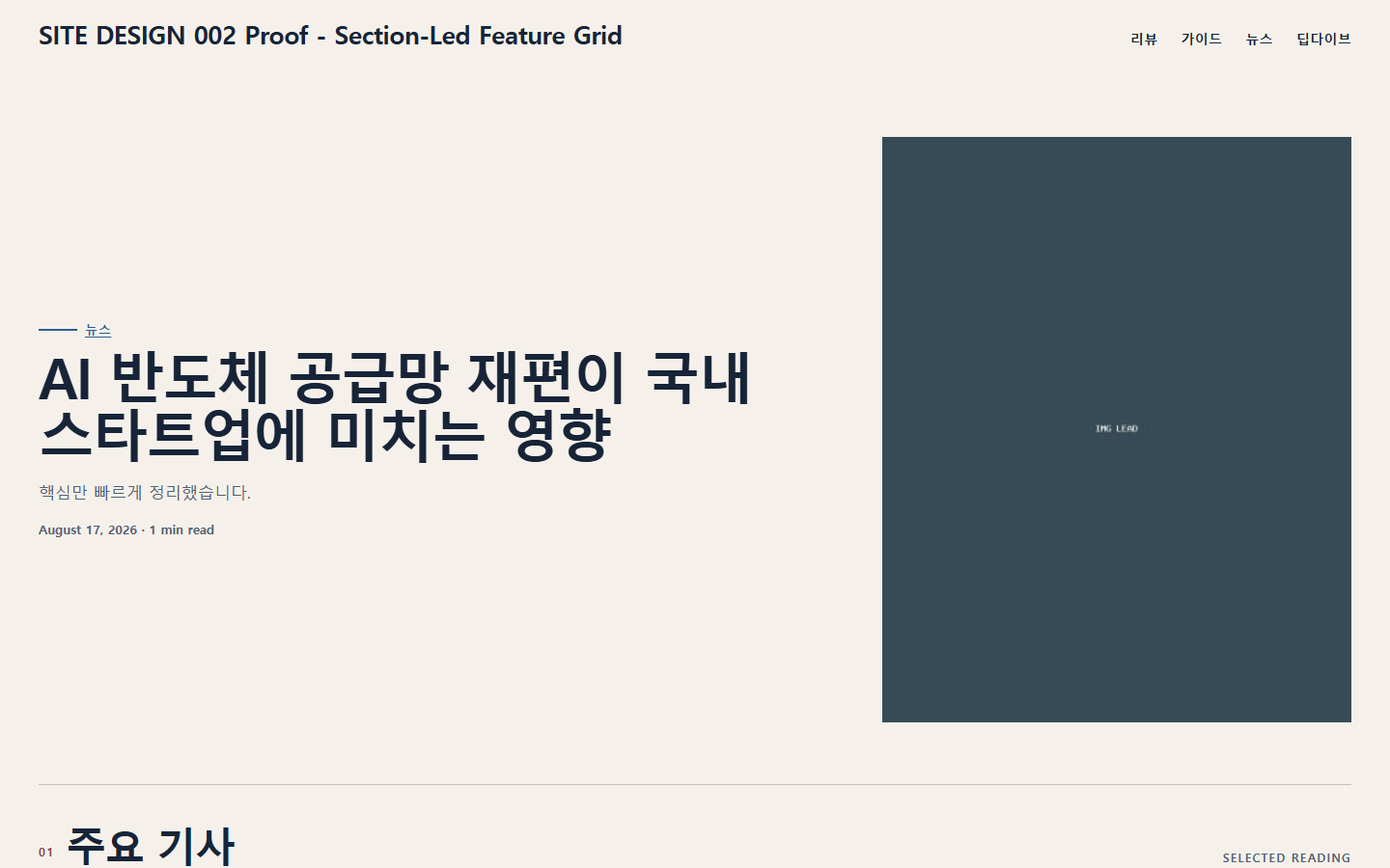
A magazine that changes feel through section structure alone, on the same foundation
Built on the same template, it feels completely different once the article order and section layout change.
View Work ↗
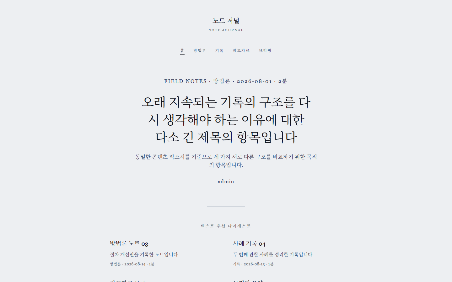
A site for reading field notes in sequence
Each note has to be finished before the next one opens.
View Work ↗
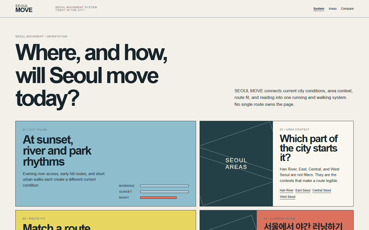
A site that groups Seoul running courses by area
Brought together the conditions people weigh when choosing a course.
View Work ↗
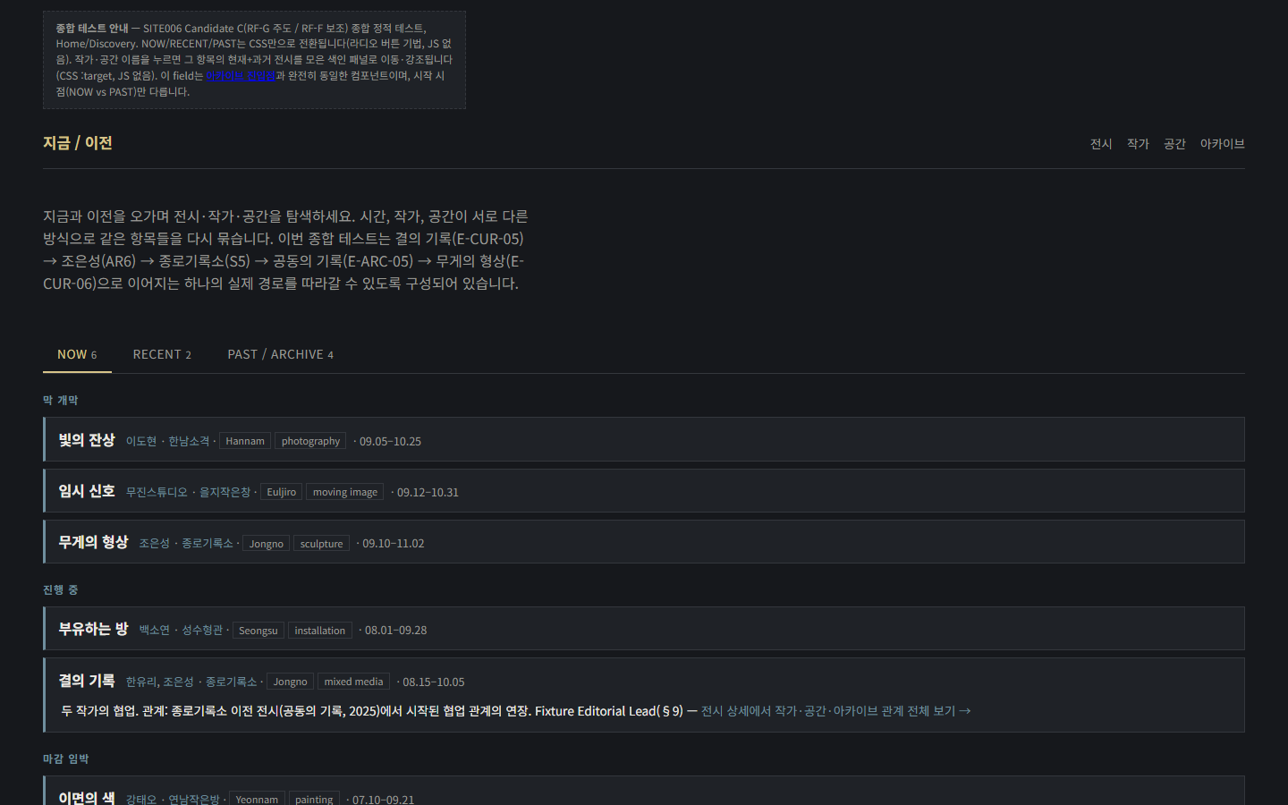
A culture archive viewed by switching between multiple timelines
Different kinds of content, gathered around a single frame of time.
View Work ↗
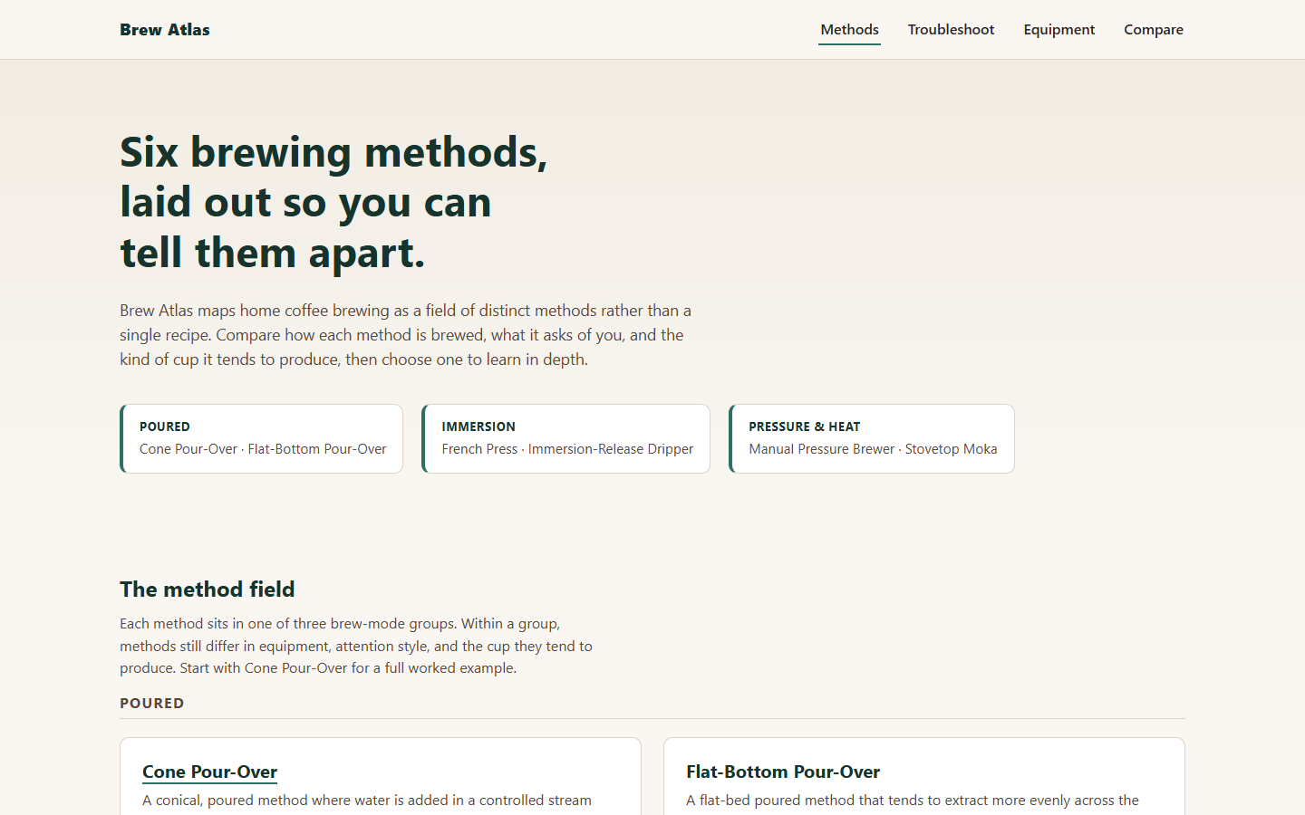
A learning site for finding information by brewing method
Split six extraction methods into three groups, each with its own comparison screen.
View Work ↗
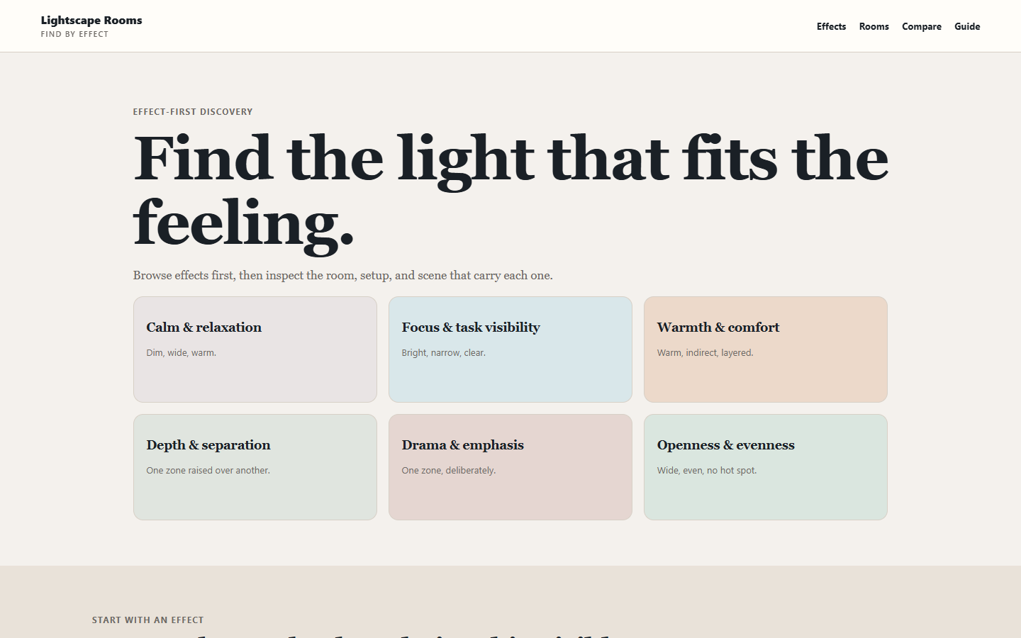
A lighting site that starts from the effect of light
Instead of listing products first, visitors choose the lighting effect they want.
View Work ↗
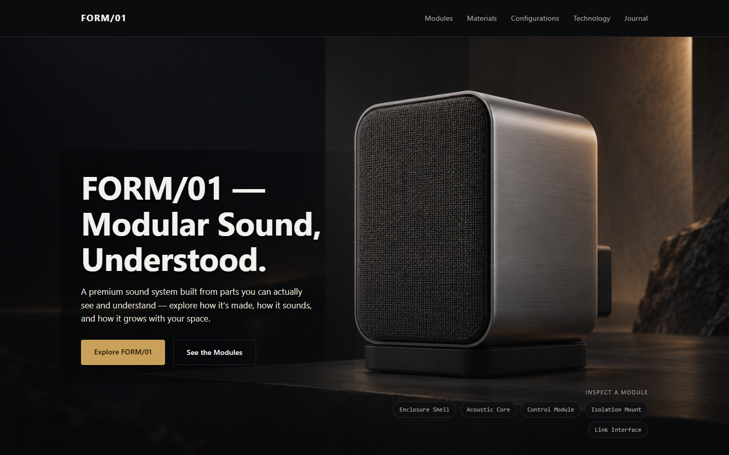
A site for a fictional modular audio product
Tried a real-time 3D model, then switched to still imagery when it didn't reach the quality we wanted.
View Work ↗
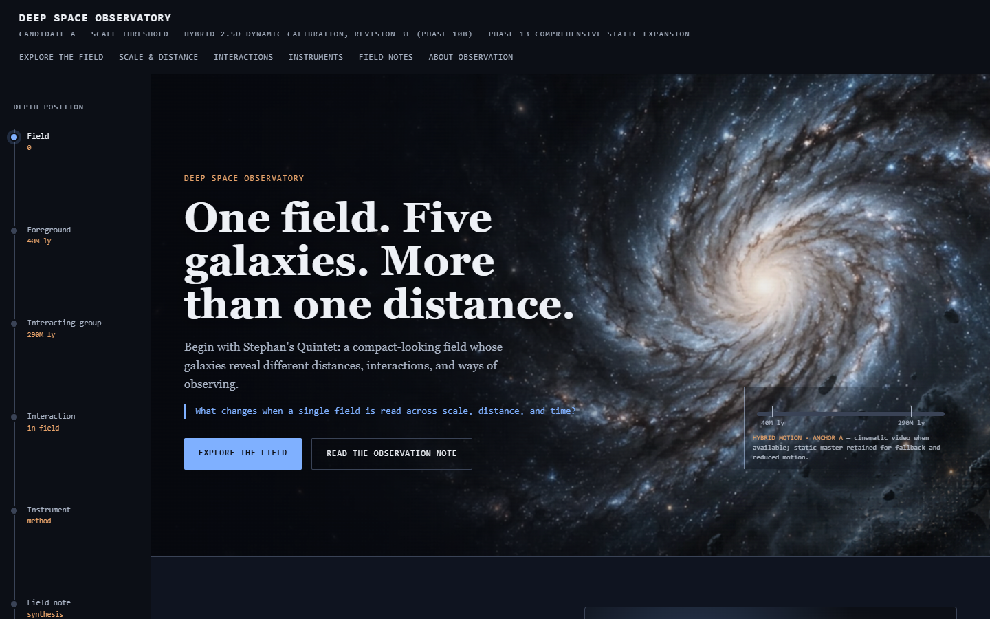
A site that conveys scale and distance through motion
Kept video and depth on the home page only, and let the other five pages read quietly.
View Work ↗
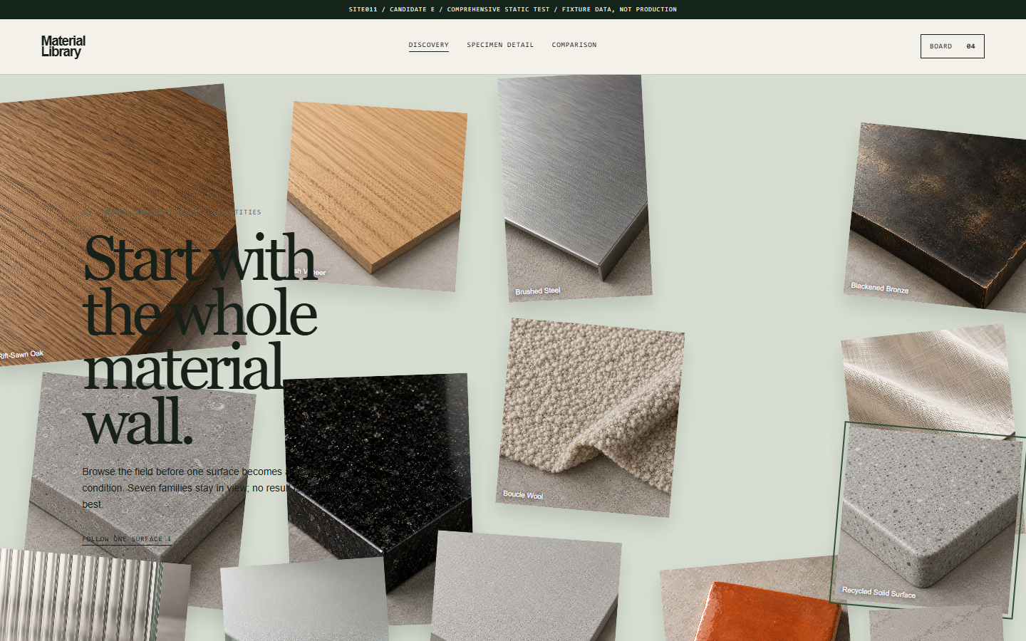
A site for finding and comparing architecture and interior materials
Rebuilt the list from scratch because the original structure didn't work for finding and comparing materials.
View Work ↗
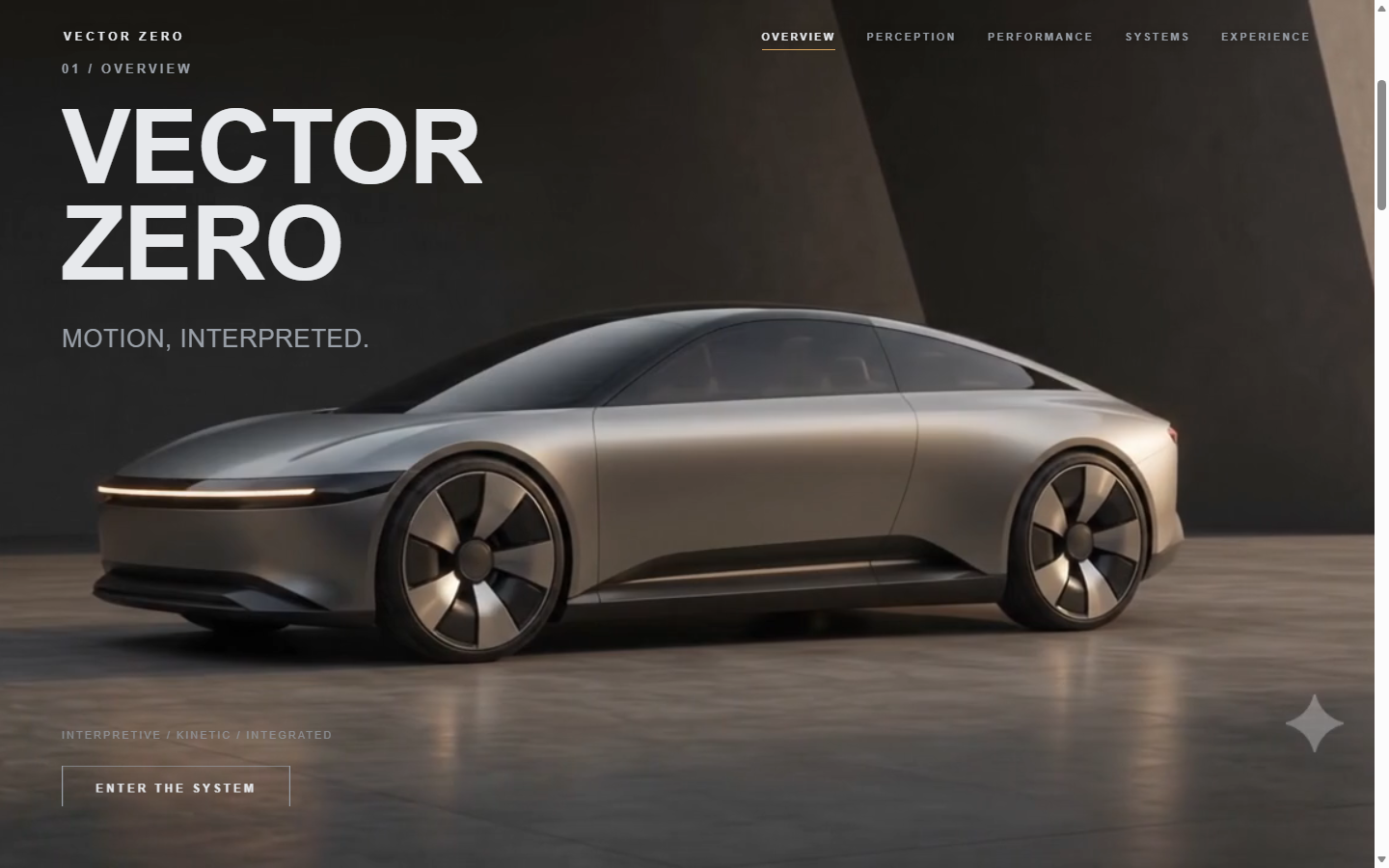
A car site that reads as one continuous sequence
Split the page into five parts, each with its own role, so specs and copy stay readable even in motion.
View Work ↗
Six ways we keep checking the work through to completion.
We don't build a single direction right away. We compare different structures and layout approaches first, then choose the one to carry forward.
Comparing directions early reduces the risk of pushing the wrong one all the way through.We don't approve work from a description alone. We render the desktop view and any other pages that matter, look at them ourselves, and only then move on.
Mobile isn't an afterthought. We check separately whether small screens can still be read and used the same way, and adjust what's needed.
Sites where motion matters get their own round of checks. We check that scroll, pointer, and transition effects don't conflict with the page structure, separately from the static pages.
We don't force the original plan through. If the finished page doesn't match expectations, we record why and revise only what needs to change.
We keep a record even after a project is finished. Documenting what changed and why makes it easier to pick up again for future edits or expansion.
Six directions drawn from work we've actually completed.
We structure the site so a product's design and features can be understood in a single flow.
We use classification, search, listing, and detail pages to make information easy to find.
We organize large amounts of content around reading order and information hierarchy.
We build ways to compare items and narrow down choices.
When motion is needed, we treat scroll and page transitions as part of the structure.
We structure the site to show the process and reasoning, not just the results.
We don't apply the same structure or motion to every project. We adjust page layout and review scope to fit each project's purpose and content.
Listed in the order we work through them.
Review scope may vary depending on the project.
Even when sites differ in character, we've run into similar problems more than once.
The more content there is, the more it matters where to start. We settled the first view and the next step first, then built the rest around them.
Learning order · page structureWhen there are many options, differences need to be visible right away. Information that requires comparison — extraction methods, lighting effects, materials — was placed side by side.
Extraction methods · lighting effects · materialsWe used video and motion, but kept the copy and navigation paths intact.
Home page motion · continuous scrollA real-time 3D model never reached the quality we wanted, so we switched to still imagery.
The final version uses still imagery.We also re-checked that the same content could be read and used on mobile.
3 reduced-motion checksSome projects had their structure or presentation reworked after we reviewed the finished pages.
4 recorded revisionsQuestions that came up often while we worked.
When there's a lot of content, we start by deciding the order. Brew Atlas built a learning order, Deep Space Observatory put the weight on the home page, and Vector Zero split a long screen into segments.
When there are many options, we show the differences side by side. Lightscape Rooms lets visitors choose the lighting effect first, and Material Library gave comparison its own screen.
Copy and information need to stay readable even while a video is in motion. Deep Space Observatory and Vector Zero each solved this a different way.
Not necessarily. FORM/01 switched from a real-time 3D model to still imagery instead.
We made sure the same content is available with reduced motion turned on. Checked on Deep Space Observatory, Material Library, and Vector Zero.
Some projects had their structure or presentation reworked after we reviewed the finished pages.
The order isn't fixed — we move back and forth depending on where things get stuck.
Replaced an approach mid-project when it didn't reach the quality we wanted.
Let the other five pages read quietly, with copy taking priority.
Restructured the flow from listing to detail, comparison, and boards.
Divided one continuous page into five parts, each with its own role.
Each site had a different problem to solve.
Reach out directly by email or Telegram, or use the form below.